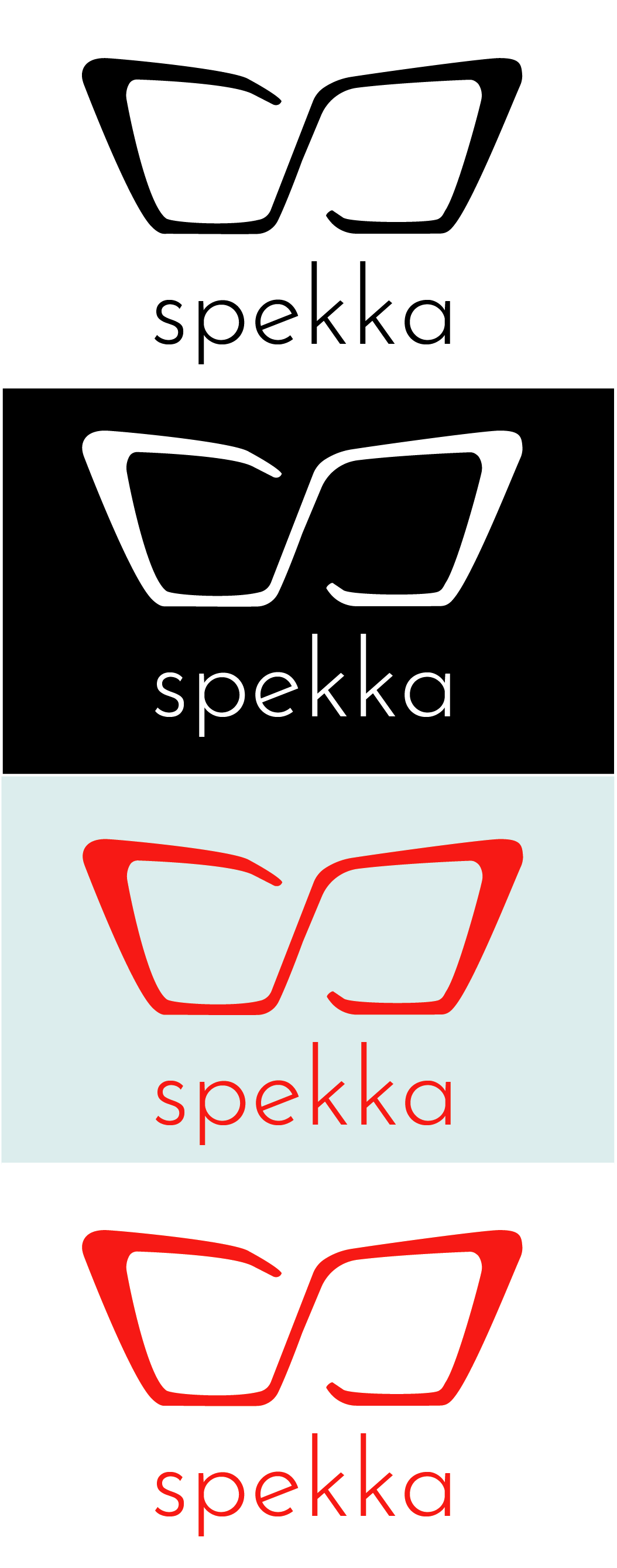
Logo For Glasses brand
Spekka is a hypothetical company specializing in locating misplaced glasses. The logo consists of an icon and a wordmark. The icon uses thick strokes and creates the shape of glasses. When turned on its side, it also creates an S shape which stands for Spekka. The wordmark is all lowercase, it uses a san serif typeface, and is thin stroked. The pairing of the thick stroked icon with the thin stroked wordmark creates balance within the logo.